Game Devlog
In this article, I will walk you through the different stages of the visual creation process for the Yaxha packaging. This board game, published by Helvetiq, draws its inspiration from Maya aesthetics.
Visual proposals for the box
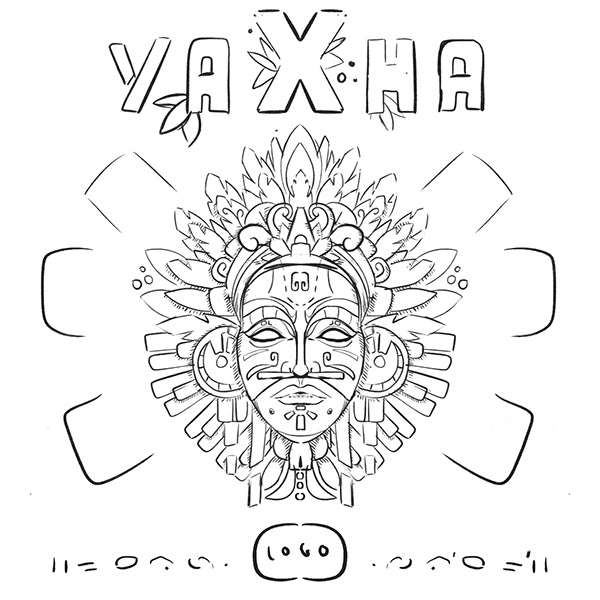
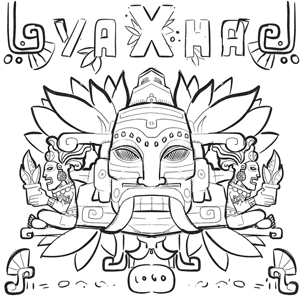
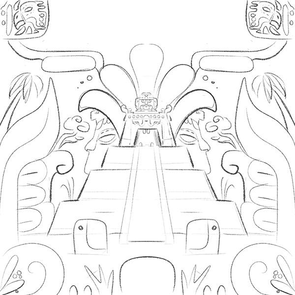
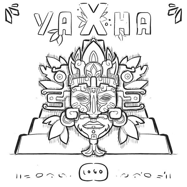
I proposed a series of sketches for the Yaxha board game cover. The compositions center on an imposing figure, evoking Maya deities or leaders. They feature complex feather headdresses and ritual attributes. Architectural elements like step pyramids and stylized vegetation frame the scenes. The “YAXHA” title uses a custom typography I created for the game. It incorporates organic motifs to enhance the project’s style. We refined the final motif selection and detail level in close consultation with the publisher.
And the winner is…
For the final look, I opted for flat design.
On one hand, it aligns with the publisher’s other titles. On the other, it is the style I am most comfortable with. To ensure harmony and clarity, I focused on clean, geometric shapes. These allow for immediate readability. This is crucial, as the game must be visible from a distance on a store shelf.
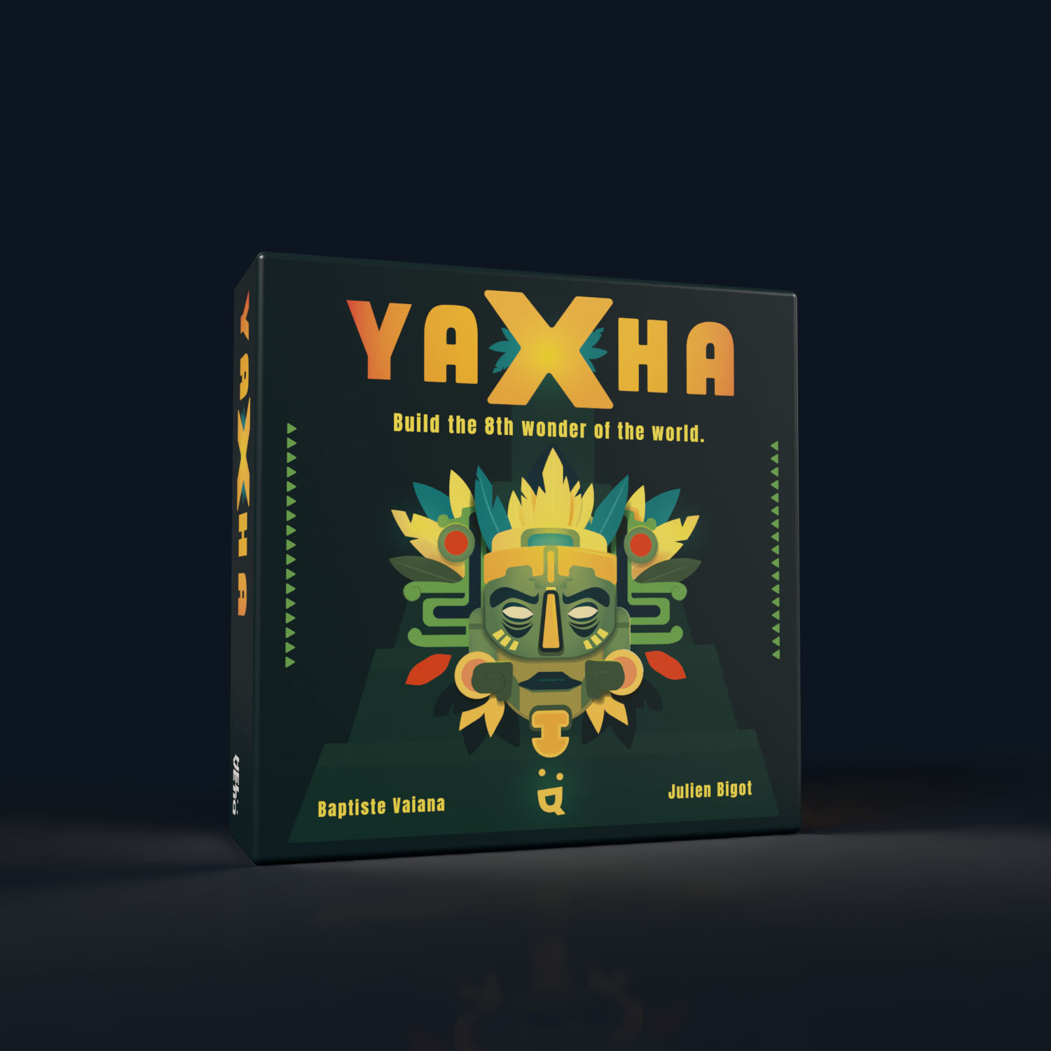
Color palette
I worked with a precisely chosen color palette, adhering to rules of color harmony. The background’s deep green evokes the jungle’s density. It highlights the warm, golden hues of the central mask. The composition’s symmetry reinforces the mask’s sacred and imposing aspect.
Meaning of the Elements
For the “YAXHA” title, I selected a heavy, impactful typeface. The subtle yellow-orange gradient evokes sunlight. I integrated a Maya pyramid silhouette in the background to add depth and context without cluttering the design. I wanted to establish a mysterious atmosphere. The goal is to spark curiosity while making the box a decorative object itself for your home 🙌
Why Do I Use Vector Art?
I always prioritize vector design for its flexibility. This technique allows for adaptation across all promotional materials. Whether for a massive convention banner or a social media post, the quality remains intact. The visual loses no definition at any scale. It is not only an aesthetic choice but also a strategic one.
A Note on the Mockup
I created this photorealistic 3D render in Adobe Dimension and Illustrator. This mockup allows for a precise visualization of the final product before it goes to print. Beyond graphic design, I provide these marketing assets to my collaborators. They are perfect for fueling promotional campaigns, e-commerce product listings, or investor presentations right from the project’s start.